Autorender Native: responsive images when you cannot change the build pipeline
srcset works when you can generate and maintain it. Native brings responsive image delivery to Shopify, WordPress, Webflow, and hand-written pages with one script tag.
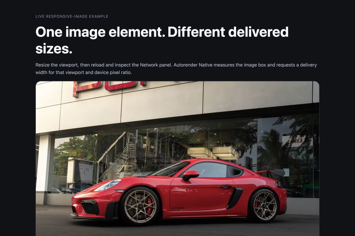
You already know the standard answer for responsive images: srcset. When you control the build pipeline, it is a good one. Your build creates the image variants, writes the markup, and keeps the sizes rules aligned with the layout.
But many sites do not give you that control. You may be working inside a Shopify theme, a WordPress post, a Webflow project, Google Tag Manager, or hand-written HTML. You have an image URL, but no convenient place to generate and maintain a complete srcset for every layout.
That is the problem Autorender Native solves. Add one script tag, mark an image, and Native measures how large the image appears on the page before requesting an appropriate size for that visitor's screen.
Add Native to a page
The installation is one script tag and one attribute on the image:
1<head>
2  <script
3    defer
4    src="https://cdn.autorender.io/native/v1/native.min.js?ws=<workspace-id>"
5  ></script>
6</head>
7
8<img
9  data-ar-src="<path/to/image.jpg>"
10  width="800"
11  height="600"
12  alt="Modern lounge chair"
13/>
Replace <workspace-id> with the public workspace ID from your dashboard and <path/to/image.jpg> with the image path in that workspace. You do not need to write JavaScript, install a package, or generate image variants ahead of time.
The width and height attributes reserve the image's space while it loads. They describe the image's proportions; Native measures the final rendered size after your CSS has been applied.
How Native chooses the image
The size of an image on the page is not always the size of the file the browser should download. An image shown in an 800 px box on a 2× screen needs more pixels than the same box on a 1× screen.
Native measures the rendered box and considers the screen's pixel density. An 800 px box might therefore request a 1600 px image on one device and an 800 px image on another:
Your HTML
1<img data-ar-src="<path/to/image.jpg>" />📐 Native measures: An 800 CSS px image on a 2× screen needs 1600 px.
The browser requests
1https://assets.autorender.io/<workspace-id>/w_1600/<path/to/image.jpg>You can confirm the result in the browser by inspecting the image's currentSrc. Native also adds an ar-done class after the optimized image loads.
Here is the same image and the same markup on two different screens:
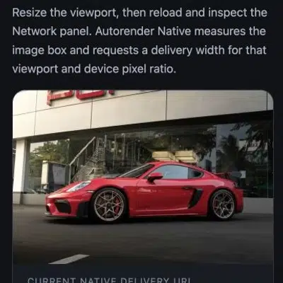

Native groups nearby requests so a page does not create a separate image for every small difference in layout size. The exact sizing options are available in the configuration guide.
Where Native fits
Use Native when you need responsive image delivery but cannot reasonably change the system that produces your HTML.
It works well for:
- Shopify and WordPress themes
- Webflow sites
- Landing pages
- Images added through Google Tag Manager
- Hand-written HTML that does not have a build step
If you already control a bundler, use srcset or an Autorender SDK instead. Those approaches give you more control over image selection and server-side URL construction.
Native is also not the best choice for a hero or LCP image. The browser can start loading a normal src before JavaScript runs, so hand-build and preload that image. The hero pattern shows how.
Native works with plain <img> elements. If an image already uses srcset or <picture>, the browser may choose a different source than Native requests. Use one responsive-image strategy per image.
Before you add it to production
Native needs a modern browser and JavaScript. Marked images have no source until the script runs. A <noscript> image covers visitors with JavaScript disabled. If the image must also recover from a runtime or delivery failure, listen for ar:error and assign a fallback src.
If your site uses a Content Security Policy, allowlist both delivery hosts:
1script-src https://cdn.autorender.io
2img-src    https://assets.autorender.io
The workspace ID identifies where the image comes from. It does not grant account access, but it is public-facing and should be treated as part of your delivery configuration.
Autorender Native is designed for the cases where srcset is difficult to produce and maintain. If you can maintain srcset, use it. If you cannot, Native gives you a smaller path to responsive image delivery.
Start with the Native documentation for all attributes, platform setup, configuration, and troubleshooting.